-
This widely circulating tweet is based on a wrong reading of the source. The graph refers to the home addresses of college applicants, not the region of the schools to which they are applying. x.com/DKThomp/status/1783254310853201943Permalink On twitter.com

 ❤️ 1 Favorite
Mood -2 🙁
❤️ 1 Favorite
Mood -2 🙁
-
Here's the original source of that graph: commonapp.org/files/Common-App-Deadline-Updates-2023.12.01.pdf It's summary data applications that use the Common App, about 1.2 million/year out of 7. million total college applications. forbes.com/sites/michaeltnietzel/2023/03/30/college-applications-are-up-dramatically-in-2023/?sh=19b3b4619c4dPermalink On twitter.com
❤️ 1 Favorite
Mood 0
-
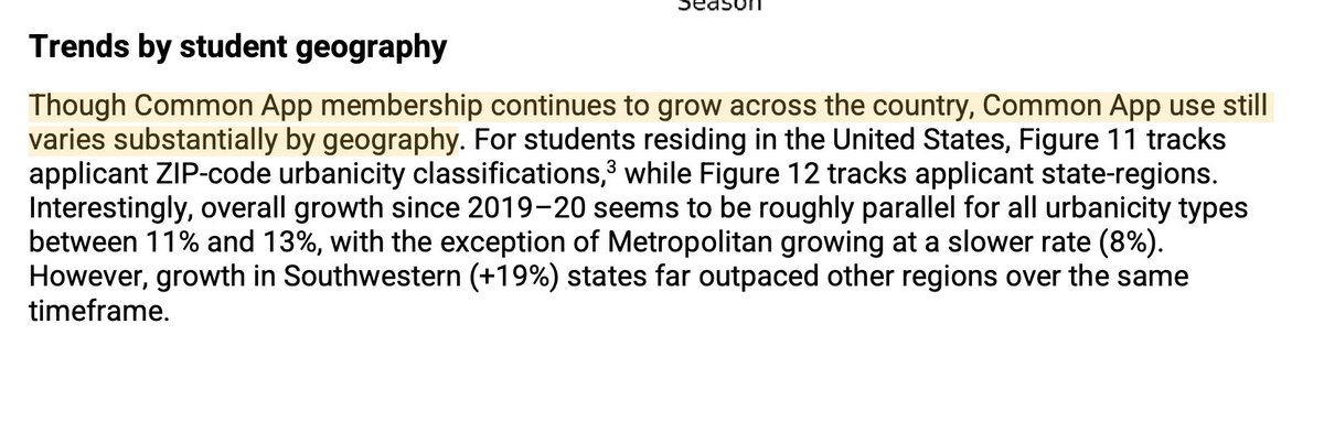
The Common App is becoming more popular, and the geographic spread is uneven. Here's the text above that graph. This is about a growing customer base, and therefore doesn't track the overall population of college applicants.Permalink On twitter.com
 ❤️ 1 Favorite
Mood +4 🙂
❤️ 1 Favorite
Mood +4 🙂
-
The graph is "by student geography" — where the applicant lives, not the geography of the institutions to which they applied. That hasn't stopped branded "data experts" (@NateSilver538 ) from jumping to highlight spurious, even invented correlations. x.com/NateSilver538/status/1783278547995373611On twitter.com
❤️ 4 Favorites
Mood +1 🙂
-
If you have a six- or seven-digit follower count, for the love of God, check your sources before you use data as evidence. @NateSilver538 @DKThomp @TheAtlantic Also, Nate, I thought this was literally your brand.Permalink On twitter.com
❤️ 2 Favorites
Mood +4 🙂