-
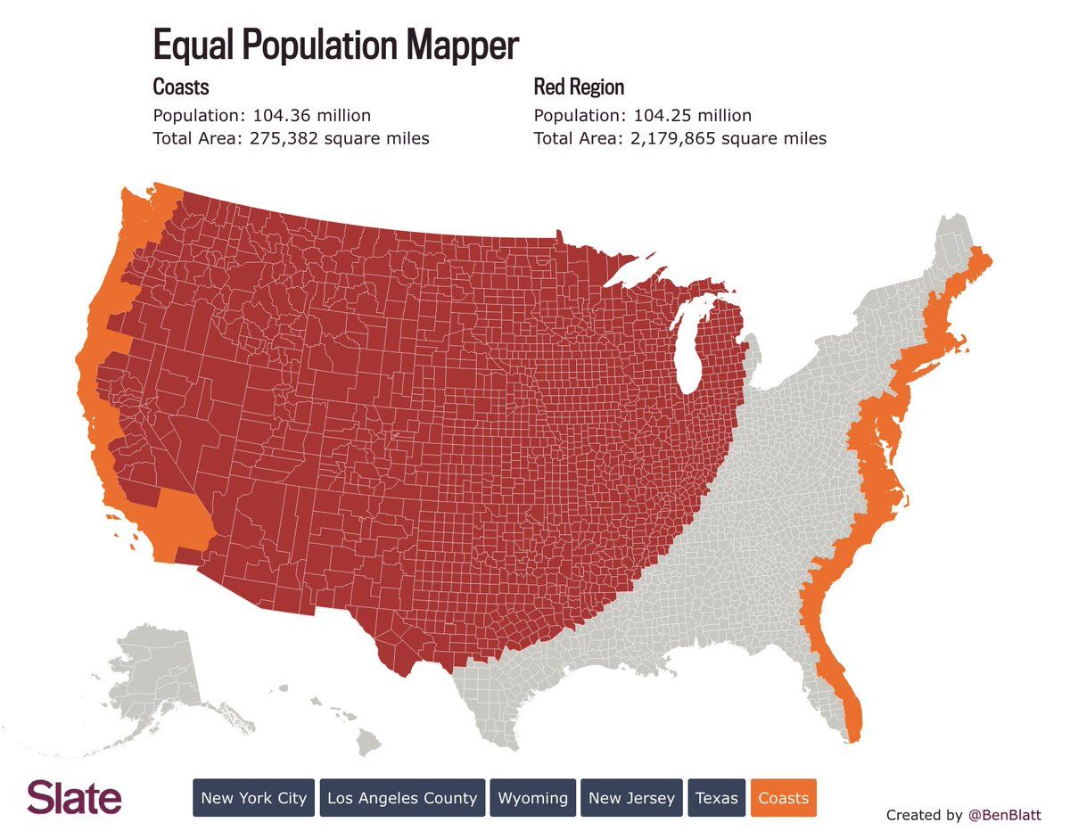
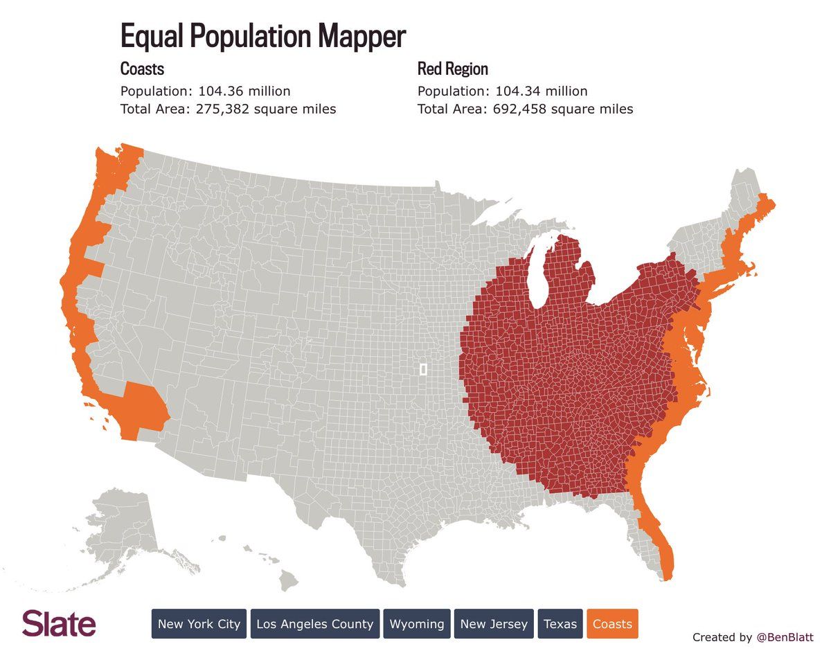
The orange and red regions of these maps of the continental US have the same number of people… Source: slate.com/articles/life/culturebox/2014/10/population_map_use_our_interactive_map_to_figure_out_how_many_flyover_states.htmlPermalink On twitter.com

 ♻️ 3 Retweets
❤️ 18 Favorites
Mood 0
♻️ 3 Retweets
❤️ 18 Favorites
Mood 0
-
And the grey remainders have only slightly more people than either colored region.On twitter.com
Mood -1 🙁