-
The NY Times has an impressive data visualization operation (looking at you, @UpshotNYT), but frequently wrong data pundit David Leonhardt gets to frame that data to fit his preconceptions. Today's exhibit…Permalink On twitter.com

 Mood +2 🙂
-
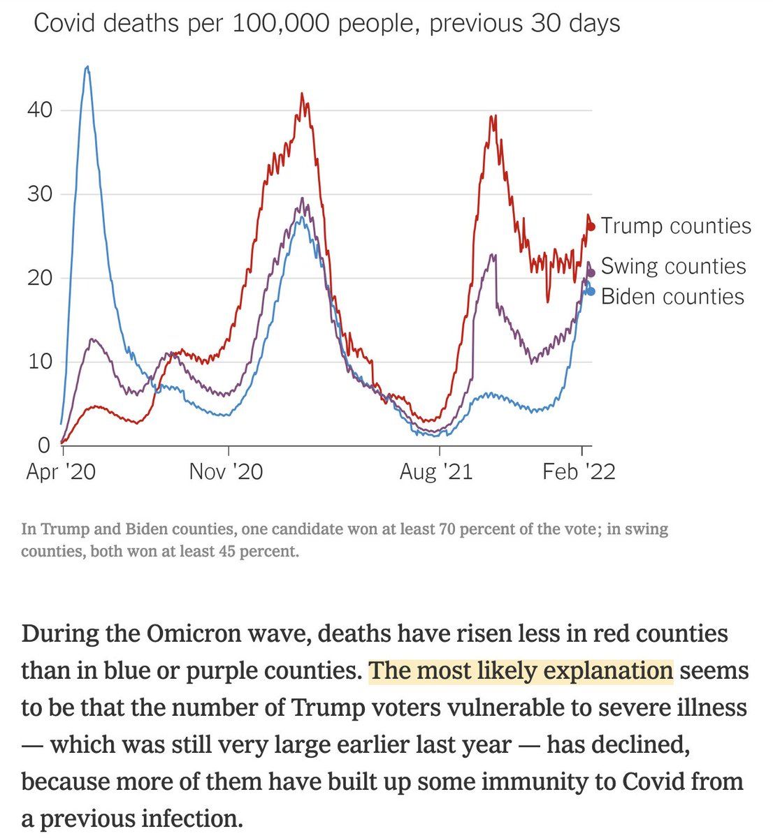
So around January 1, COVID death rates spiked in Biden-voting counties, but not Trump-voting counties. Amateur epidemiologist @DLeonhardt says "the most likely explanation" is Trump voting counties' greater immunity due to previous infection.Permalink On twitter.com
Mood -1 🙁
-
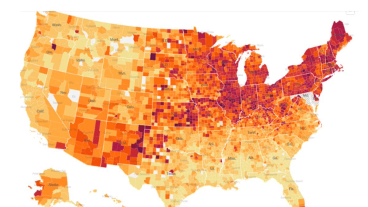
Actually the simplest explanation is that Omicron hit blue counties first, because it arrived via international travel, just like the first round of COVID. (see map from mid-December) That's why the blue curve trends upward first, and the red curve upward later.Permalink On twitter.com
 Mood +2 🙂
-
(Even this map understates the polarization in Omicron since it also include a midwest Delta wave.)Permalink On twitter.com
Mood 0
-
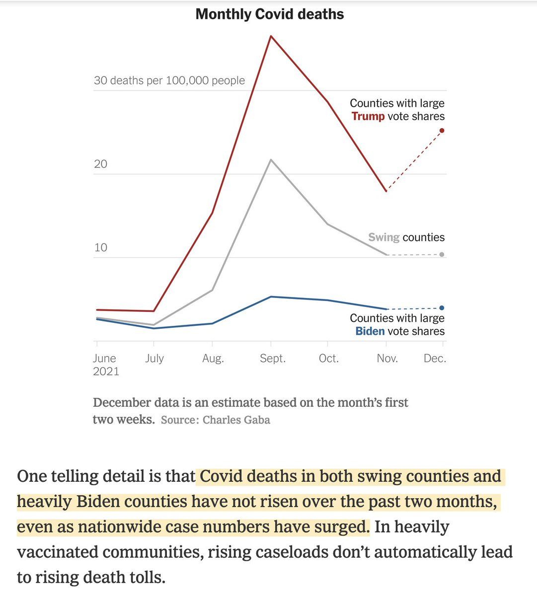
David Leonhardt is still struggling with the idea that deaths rise several weeks after cases, something that tripped him up the last time he reported on this data, on December 17. At that time, he predicted that the blue-county death rates would remain low.Permalink On twitter.com
 Mood -5 🙁
-
Maybe this is all easier to see living in Tennessee, where Omicron hit our blue-leaning cities first and hard, and then spread out to the whole state. The deaths from the rural wave are still coming in.On twitter.com
Mood -3 🙁